
Kait Duffin
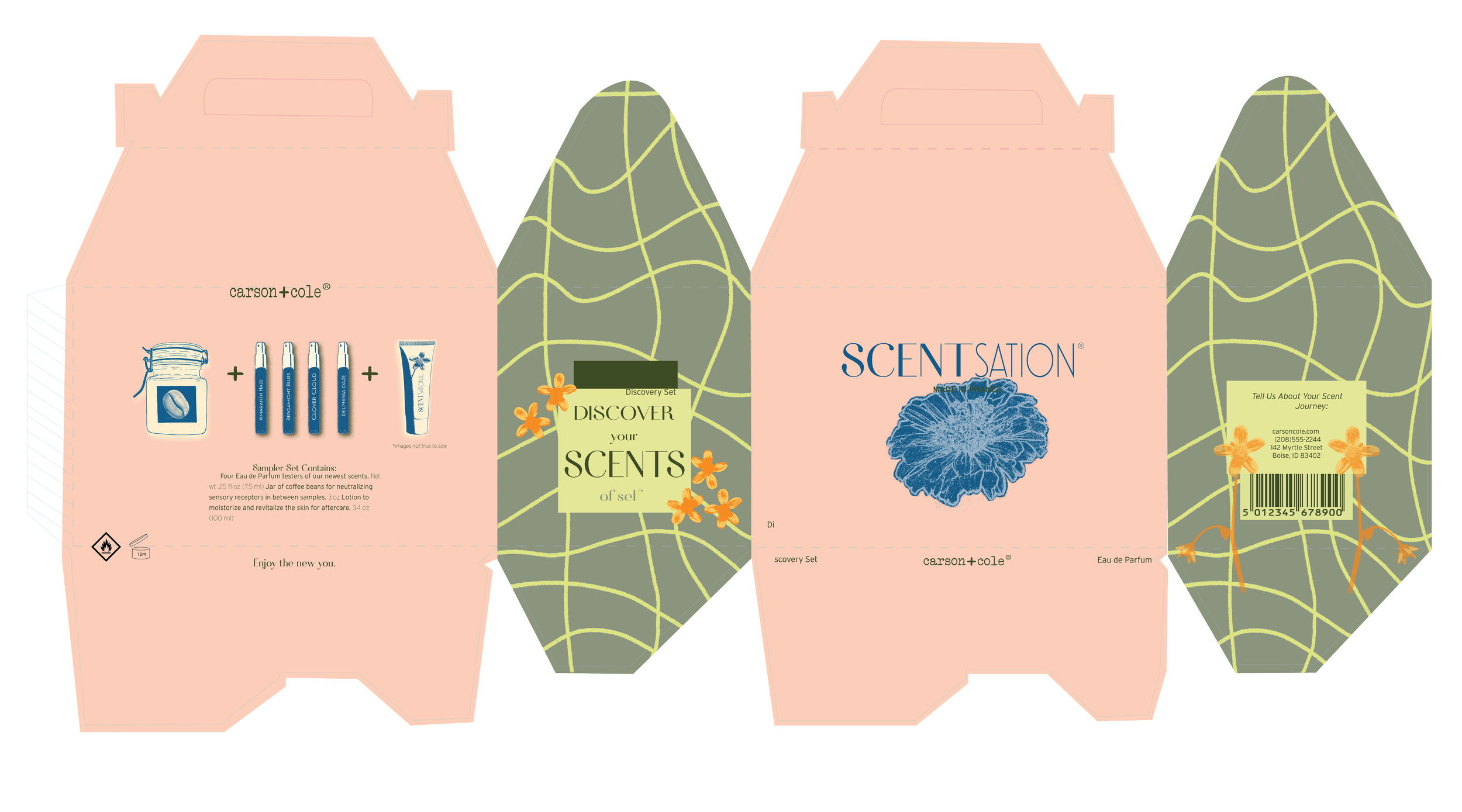
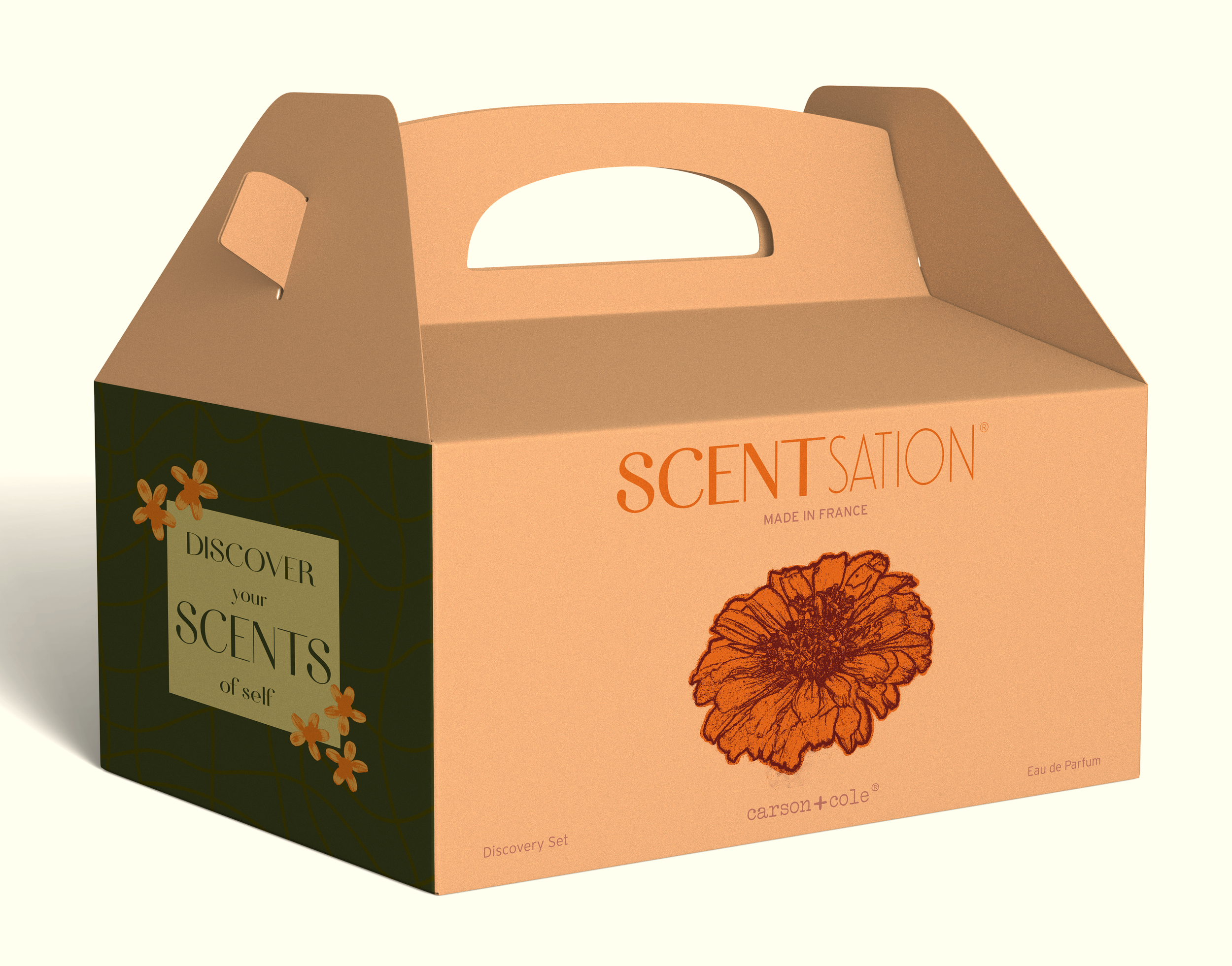
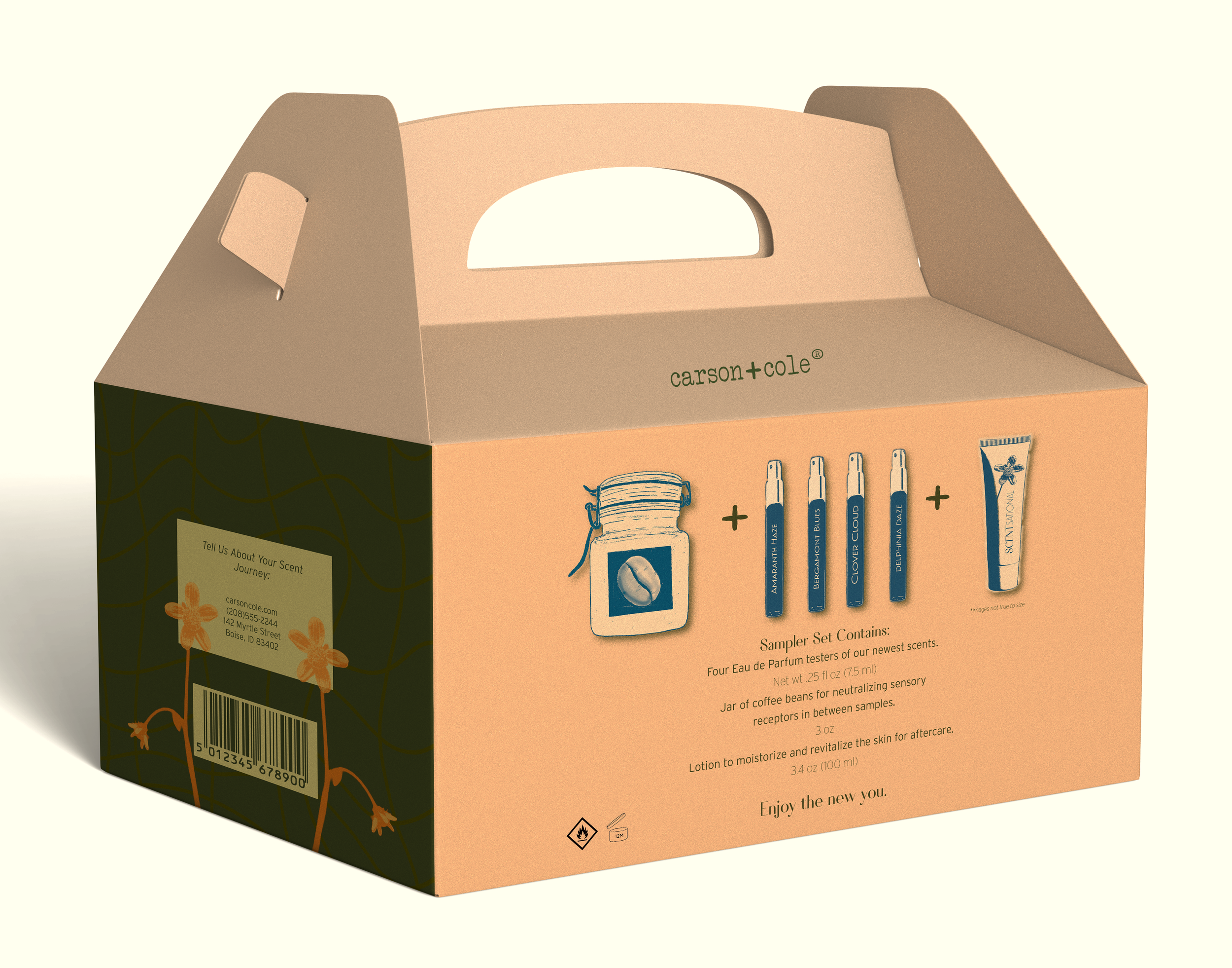
Gable Box
I went out of my comfort zone on this project. The design, color palette, typeface, and product shape really pushed me to think minimally and incorporate less in order to say more. I worked with negative space and photography instead of illustration like I’m used to. I kept myself to clean, serif typeface.
The color palette was given to me and was pushed to work with what I had. I did most of my work in photoshop and through that process I learned a lot about color manipulation and how much you can work with it depending on your desired output. Figuring out the dieline and making all my cuts accurate really gave a run for my money. Lots of rework was done so it would fit together just right so it would be able to stand on its own.