
Lets Talk Type
Typography is why I got into design in the first place. I specialize in organizing all kinds of typeface in a way that does not feel overwhelming while remaining eclectic and engaging.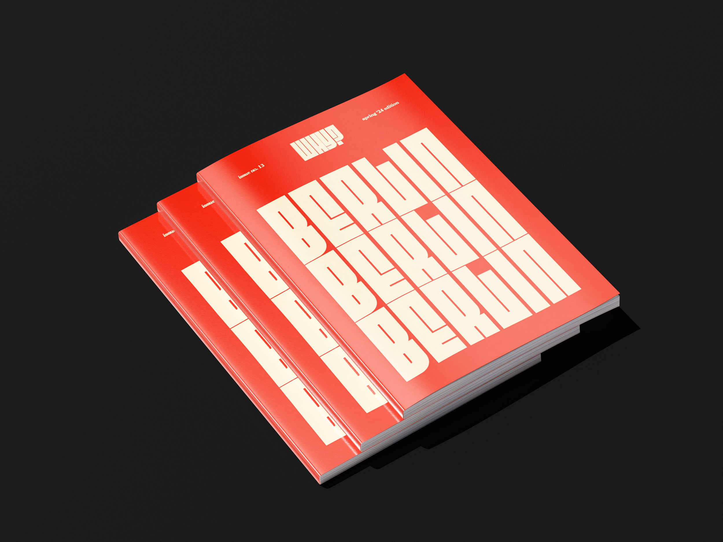
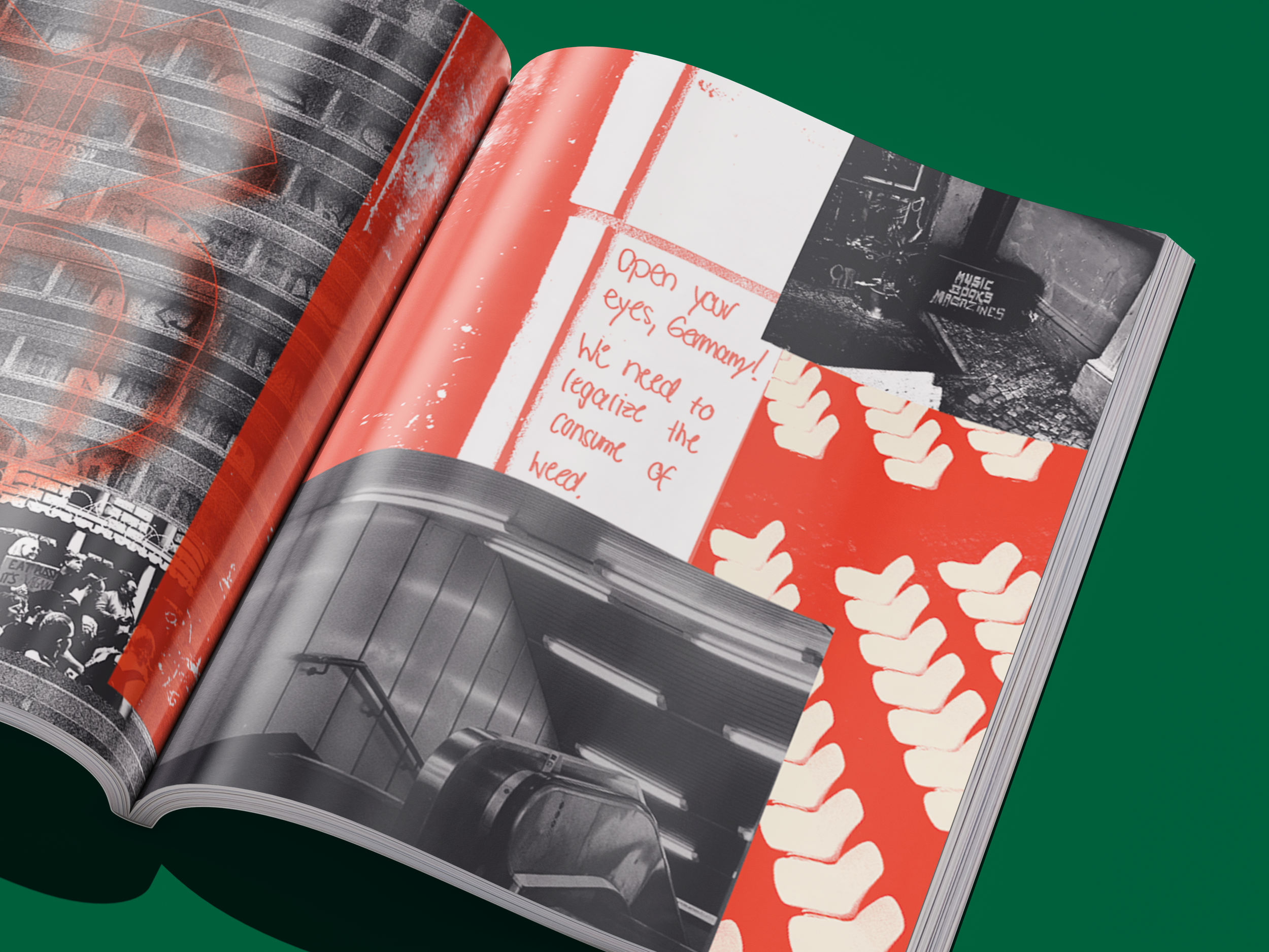
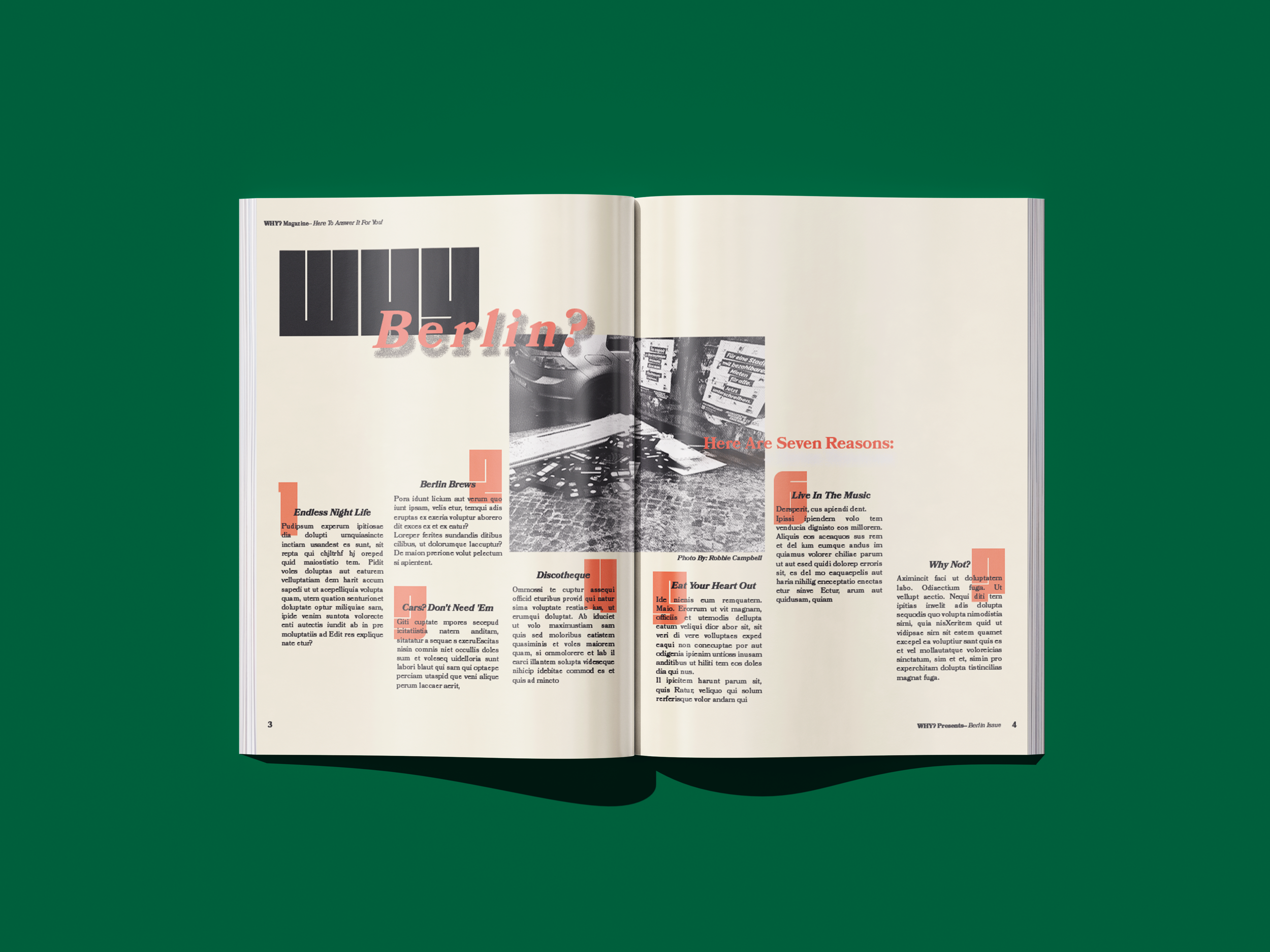
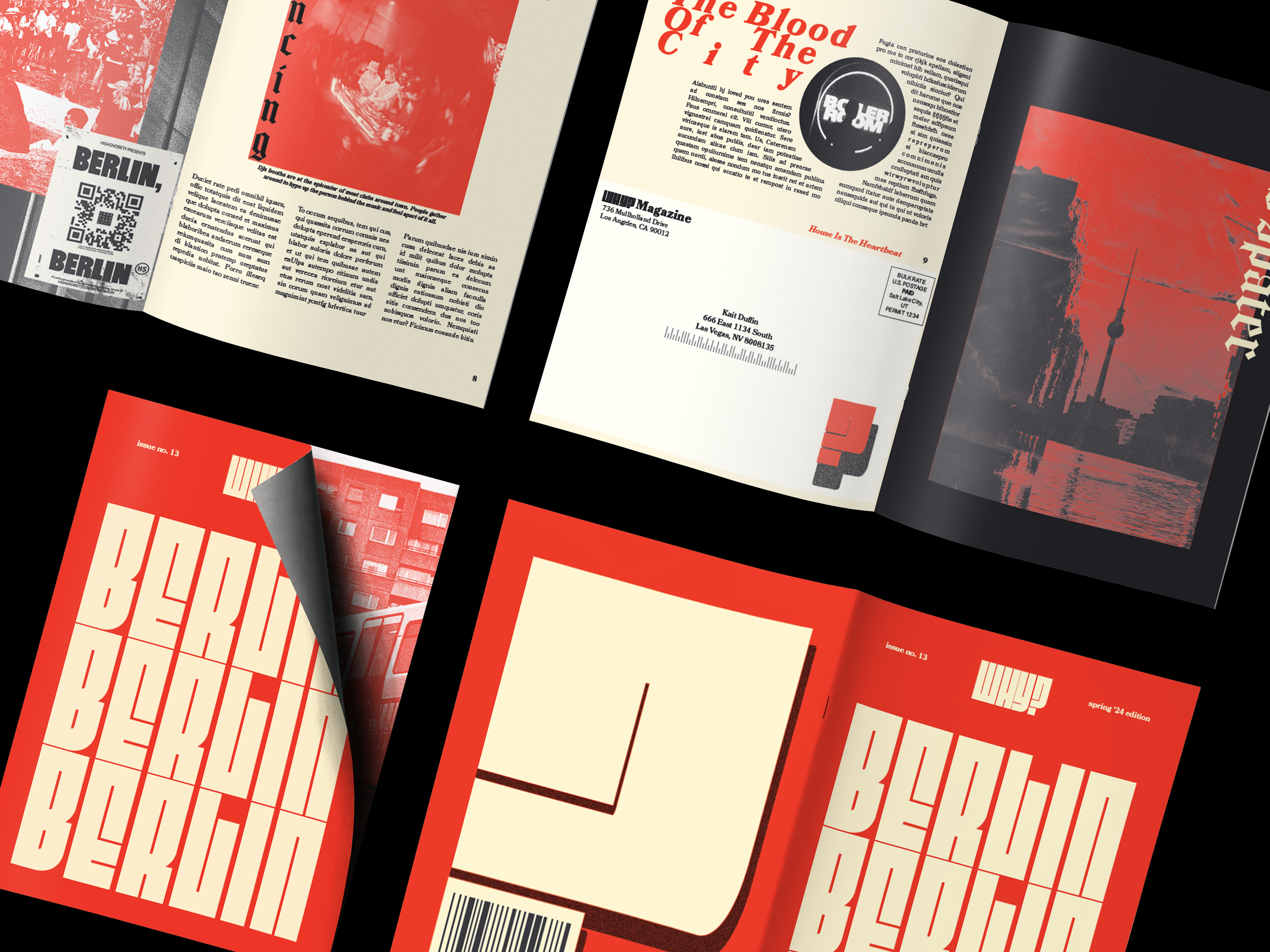
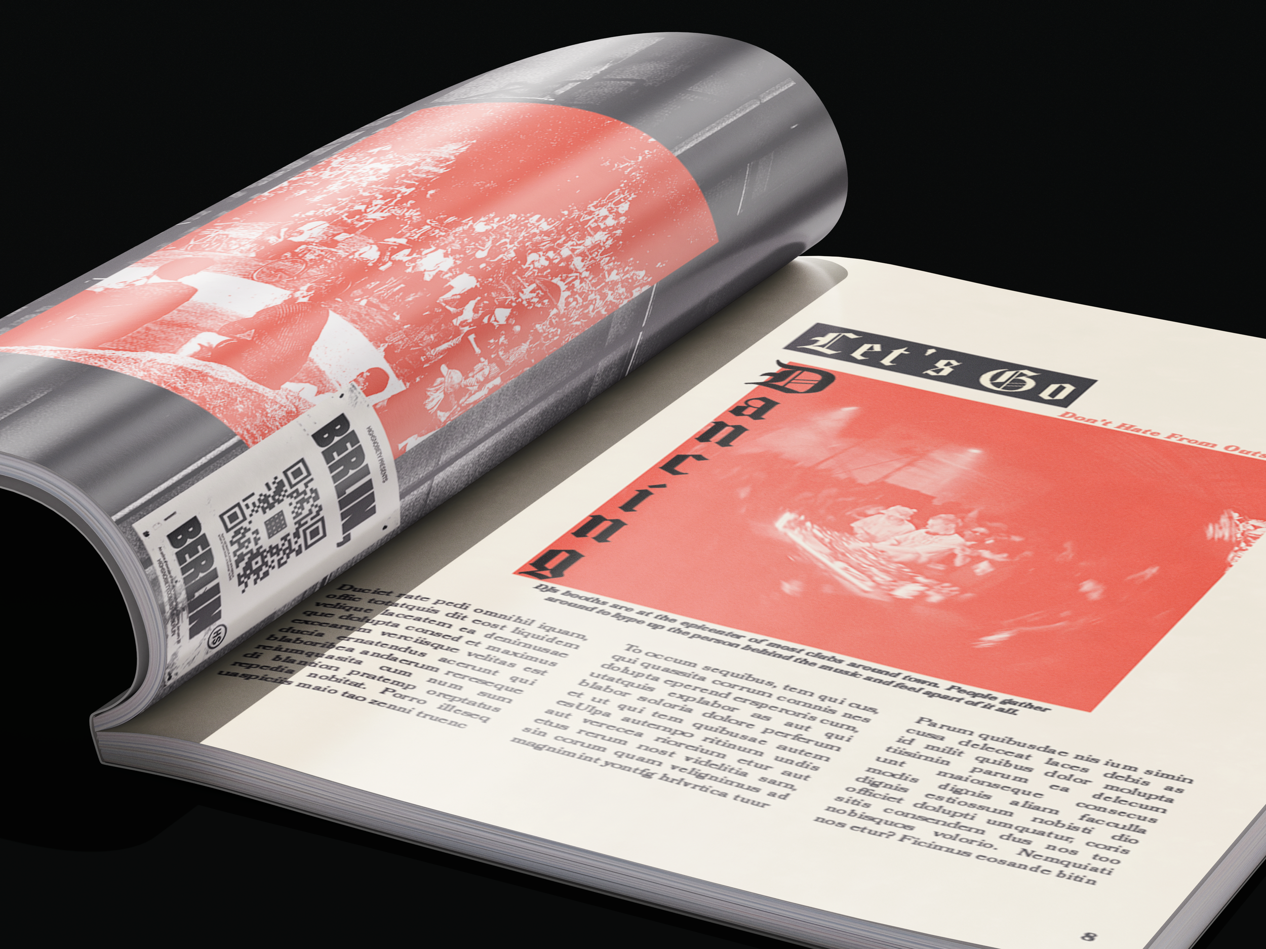
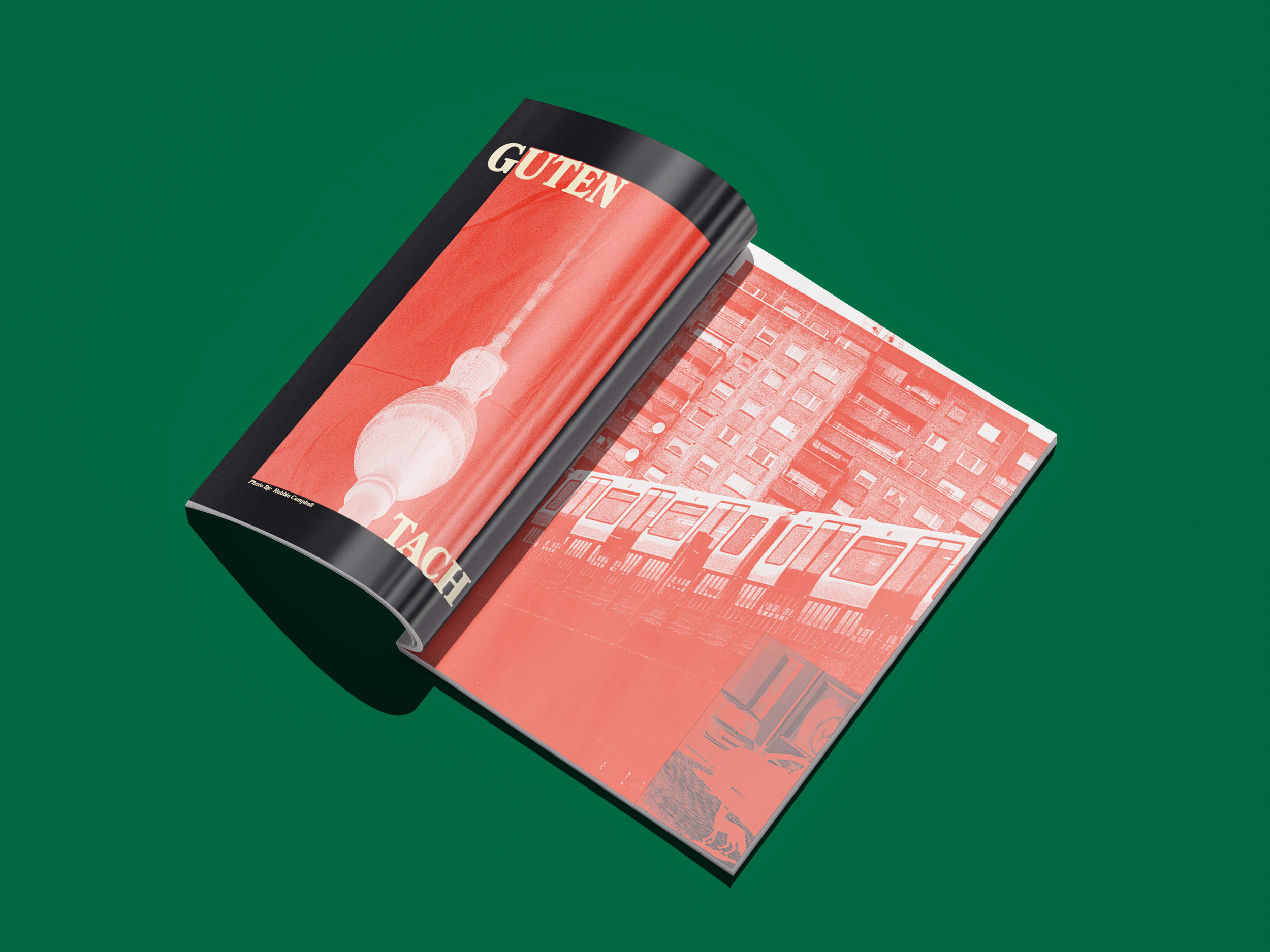
WHY? Magazine
A travel guide I created to help individuals get a deeper glance into a destination of their choosing. The idea can be applied to a multitude of places allowing the project to grow in many directions. I used photoshop on images I got from a couple friends that live in Berlin. Highlighting the music scene, and street culture. I wanted this magazine to match the energy of my brand, showcasing the seemingly mundane and allowing the reader to get a fresh perspective on traveling to Berlin.
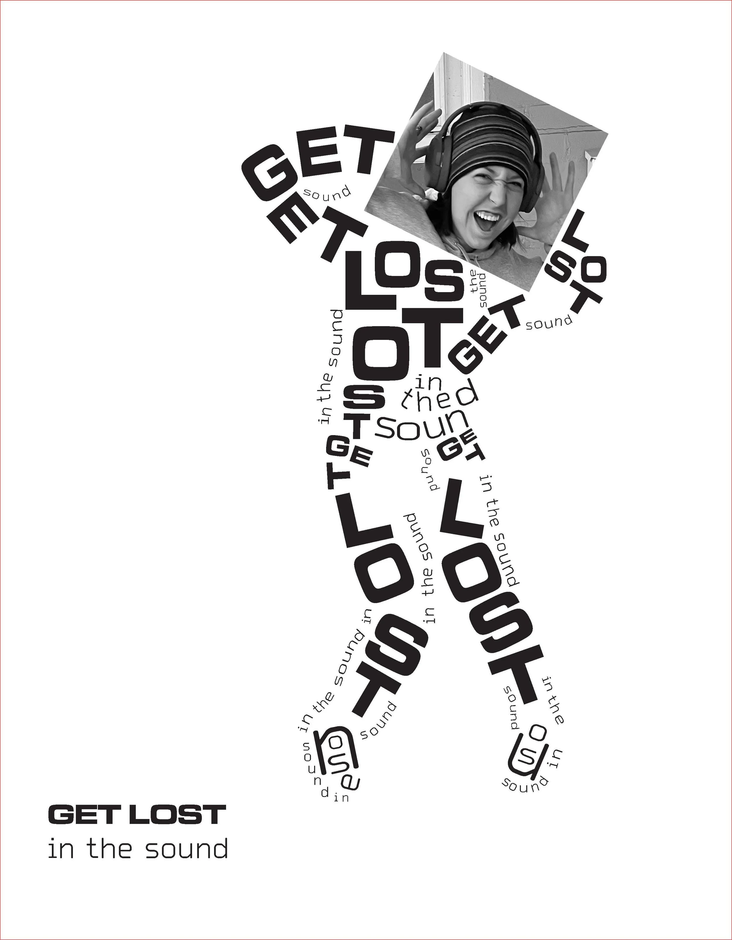
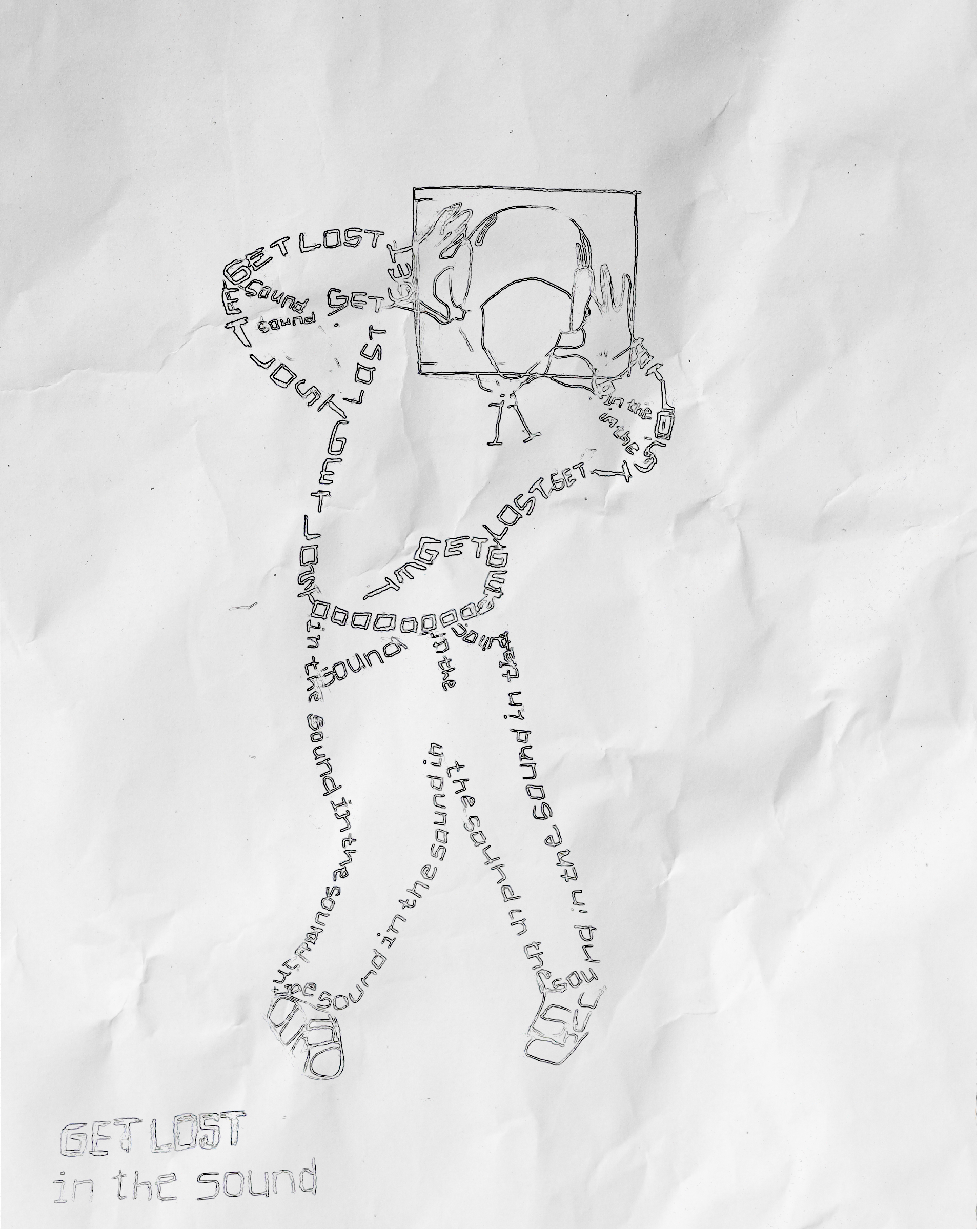
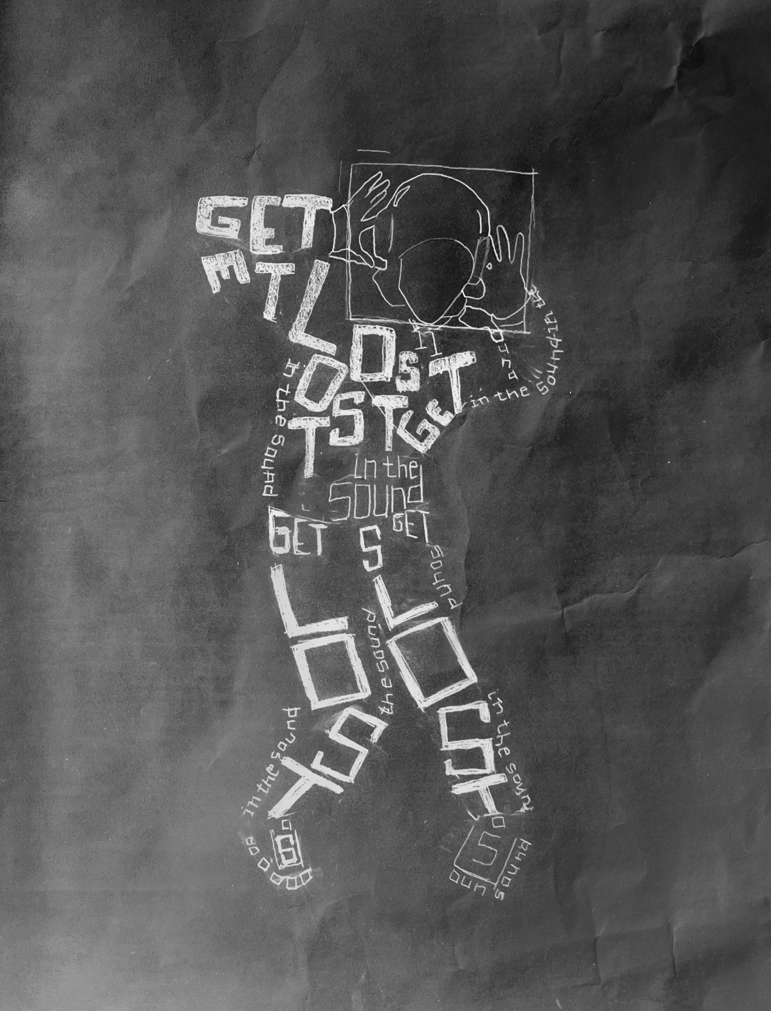
Get Lost in The Sound
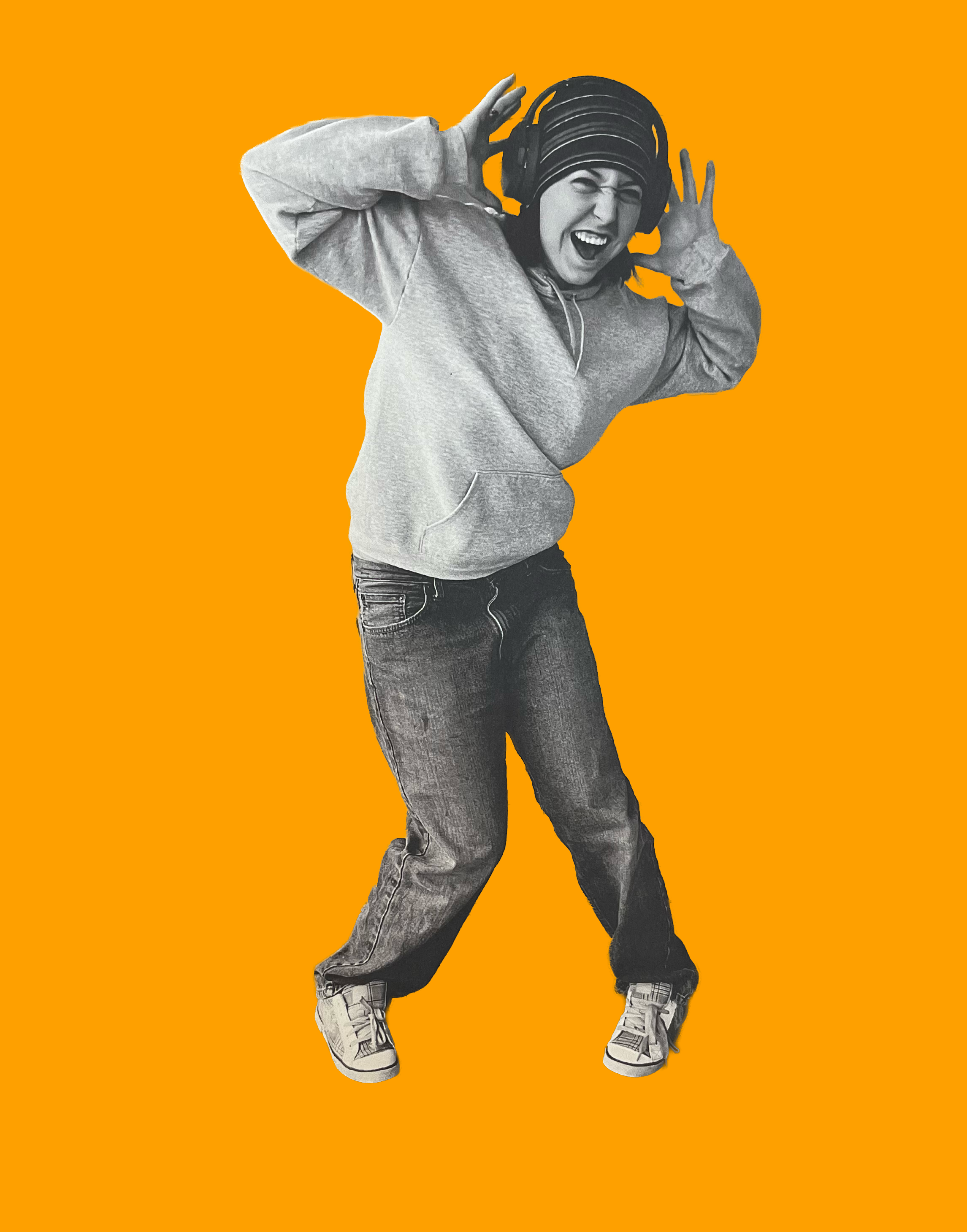
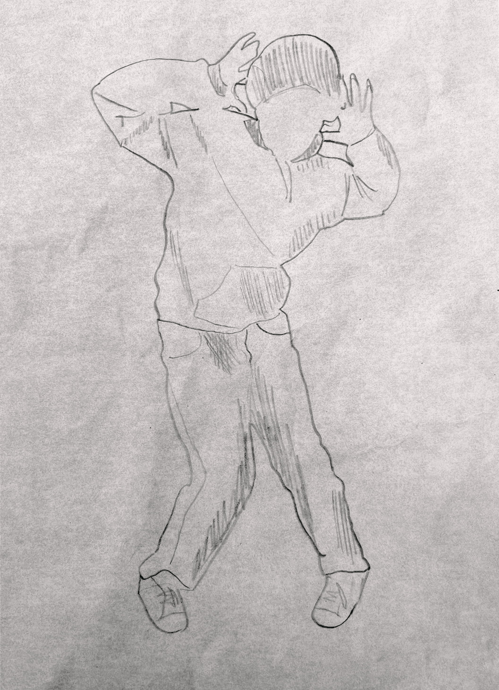
I started this project by taking different photos of my friend trying to find a pose that conveyed energy and was visually interesting. I was inspired by early 2000s iTunes ads. Full of movement and focusing on the form with it being black outlines of people dancing. I created the design in illustrator by choosing two different typefaces that contrasted each other with the boldness of ‘get lost’ and the thinner technologic feel of the ‘in the sound.’ I got to play with angles and playfulness that mimics the clothing.